Friday, 30 April 2010
Thursday, 29 April 2010
Test Shots
Posted by Sabiina-x at 05:54 0 comments
Wednesday, 28 April 2010
Picture for Interview Page
Posted by Sabiina-x at 01:28 0 comments
Monday, 26 April 2010
Final Name For Magazine
After playing around with many different names and experimenting, I chose the name " Un-Wiind" for the final name for my magzine. I had a lot of choices that I could choose from, however I thought Un-Wiind best represented my Hip Hop genre and would attract to my target audience. I first wrote the name as "Unwind" however, later on changed it to " Un-Wiind." I added the dash and the two i's, as I thought it created a different effect to the title, make it recognisable and to create it's own identity.
Posted by Sabiina-x at 11:43 0 comments
Possible Magazine Names
These were possible names for my music magazine that I came up with as they best suited my music genre :
- Un-wiind
- Vibes
- Pulse
- Ease
- Upbeat
- OnBeat
- Rythmatic
- FWD
- Replay
Posted by Sabiina-x at 11:35 0 comments
Posted by Sabiina-x at 11:28 0 comments
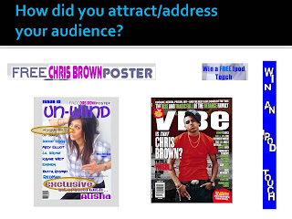
 This is the analysis of my contents page. It shows what magazine coventions I have used in my final contents page.
Posted by Sabiina-x at 11:18 0 comments
Interview Page Analysis
 I analysed the interview page, to see what kind of magazine conventions I had for my final magazine and would the finish product appeal to the target audience.
Posted by Sabiina-x at 10:46 0 comments
Sunday, 25 April 2010
Planning My Interview
1) What inspired you to join the music scene?
2) How do you feel now after joining the music scene?
3) How did you first find out that becoming a singer was the right path for you?
4) What were you first steps after becoming a singer?
5) How has the response been after becoming a singer?
6) What has your life been like after becoming a singer?
7) Tell us about your new upcoming album?
8) How did your decide on the sorts of tracks you wanted featured on your album?
9) What are you planning on doing after this interview?
10) What were you doing last night?
11) Tell us and interesting fact about yourself that no-one else knows.
12) How do you advertise your music and album
13) What is your ultimate goal with your music career?
Posted by Sabiina-x at 13:55 0 comments
Analysing Final Front Cover
Posted by Sabiina-x at 13:49 0 comments
Masthead Designs
 I researched the different kinds of mastheads for exisiting popular magazines. Some were from Hip Hop magazines and others were from various genres. This gave me an idea on how to design my masthead that would be attracting and would stand out. I needed to make my masthead different to the others for it to be appealing, otherwise it would look the same as the other magazines and would not have its own identity. By doing this I realised that using the colour red for my masthead would not be a good choice, as a lot of other magazines had used red as their main colour for the heading.
Posted by Sabiina-x at 13:22 0 comments
 I took many shots using different camera angles, to experiment with the various shots that I could use and produce to use for my magazine and that would attract my target audience. Out of many pictures I took, I thought that these two shots would be most appropriate for my gebre of magazine, in order to create the Hip Hop effect.
Posted by Sabiina-x at 12:45 0 comments
Posted by Sabiina-x at 12:36 0 comments
Saturday, 24 April 2010
masthead designs
 In order to be able to choose the right kind of style and font for my masthead, I created the title of my magazine "Un-Wiind" in various different fonts, which would help to represent the name and reflect the Hip Hop / Rap theme, to attract my target audience.
Posted by Sabiina-x at 12:07 0 comments
Monday, 19 April 2010
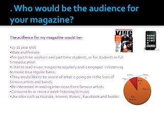
Questionnaire..Target Audience Research


I designed a questionnaire in order to help me create my magazine. I asked 10 people from my target audience (13-21 year olds) different questions which I thought would be useful to me. It would allow me to get an idea of the things that most appealed to my target audience and would want them to buy my magazine over others. The questions included "how much they were willing to spend on magazine" and "what draws them into buying a magazine." I was therefore able to construct a reader profile by using the information obtained by constructing and carrying out this questionnaire.
Posted by Sabiina-x at 17:53 0 comments
Posted by Sabiina-x at 11:44 0 comments
Posted by Sabiina-x at 11:14 0 comments
 This was what my contents page looked like before I added a few changes to it, as I thought that the contents page did not look right. The writing I thought was unsuitable and the strip on the side did not stand out enough to catch the readers attention, as I found out that many people buy magazines if there is a free competition included in it. Therefore I made a couple of changes, so that my contents page would look more like an contents page and would appeal more to the consumers.
Posted by Sabiina-x at 11:03 0 comments
Posted by Sabiina-x at 11:01 0 comments

Posted by Sabiina-x at 10:56 0 comments


